
Step by step approach for reading chart patterns

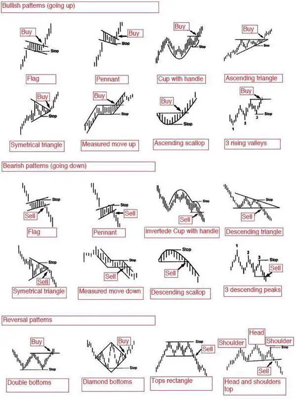
 Chart patterns are visual representations of the behaviors of buyers and sellers around different price levels. Chart patterns are bullish when a chart is making higher highs and higher lows, they are bearish when they are making lower highs and lower lows, and range bound when they have defined support and resistance levels and no trend. 

Trading chart patterns is primarily momentum trading where a breakout of an existing pattern is the signal to enter a trade. Technical traders use the breakout of an existing trendline in a pattern to establish an entry point. After they are in, then a trade is managed to maximize a gain or minimize a loss to create a good risk/reward ratio. Chart patterns can signal breakouts, reversals, and continuations of current price action.

Trading chart patterns step by step:

  1. Identify a pattern on a chart based on the parameters of price action. (The chart pattern cheat sheet below can be used as a guide).
  2. In a bullish chart pattern a buy signal is triggered on a break and follow through above a trendline of resistance of the existing price range consolidation after an upswing in price action. In a bearish chart pattern a sell short signal is triggered on a break and follow through below a trendline of support of the existing price range consolidation after a down swing in price action. 
  3. After a trade entry a price target can be established based on previous resistance on a long term chart or overbought readings for a bullish chart or previous support on a long term chart or oversold readings for a bearish chart. 
  4. A stop loss can be set at a reversal back through previous range support for a bullish pattern or a break back over previous range resistance for a bearish pattern. 
  5. Position size should be conservative and not risk a big loss if the chart pattern does not follow through with a trend. 10% of total trading capital is a good general position sizing parameter for most stock trades, less if a chart is volatile, more if an index ETF is being traded. For options and futures trading it is smart to never risk more in position sizing than you are willing to lose capping risk at 1% to 2% of total trading capital on a position that can quickly go to zero. 
  6. Chart patterns can increase the odds of success by going with the trend and flow of current price action. 

Chart patterns are not predictive tools they simply show the odds of the direction a chart is likely to go. When the momentum plays out after a breakout then the magnitude of the profits can be many times greater than the loss that is minimized by a stop loss. Chart patterns are ways to create great risk/reward ratios through reactive technical analysis, they are not crystal balls. Profitability comes from big wins and small losses not accuracy with a high win rate. 

chart patterns cheat sheet

Comments

Popular posts from this blog

STOCK CHART PATTERNS

  Stock chart patterns   are simply a visual representation of the prices buyers and sellers bought and sold at in the past. There is no magic in a chart pattern they just show you what happened in the past and what has a higher probability of happening in the future. The best use of chart patterns is to take a wider view of the trend on your time frame of choice and follow the path of least resistance.  A chart pattern can show that a stock is in a range with defined resistance and support. A chart could also show an uptrend of higher highs and higher lows or a downtrend of lower highs and lower lows. Stock chart patterns signal whether a stock is under accumulation or distribution or just trading in a defined price range.  The most popular use of stock chart patterns is for breakout trading signals as the probability increases of a move in a specific direction after a price breakout of a previous support or resistance. They are basically momentum indicators. The va...

Stock Screener Settings for Top Growth Stocks

  One of the best stock screening filters for finding growth stocks are the parameters of the CAN SLIM Investing System that was created by William J. O’Neil. These parameters were quantified by his study of the fundamental company metrics of the largest winning stocks in the history of the U.S. stock market going back over 130 years. The stocks that historically met these guidelines were the ones that eventually created the majority of the Alpha in the stock market over the long term during bull market cycles. He looked for the fundamentals that companies in the first stages of big growth cycles possesed.  The CAN SLIM Investing System looks for specific fundamental measurements of a company’s strength of earnings and sales along with its growth rate. It also considers more discretionary company filters like innovative products or business models along with good management.  A CAN SLIM fundamental filter is a great place to start if you are looking to build a w...

Golden Cross Stock Trading Strategy

  he Golden Cross stock trading strategy is an example of a simple long term trend following system. This is one of the most popular and famous bullish moving average crossover signals that is watched and talked about on financial media when they occur on major indexes. The second most popular being the loss of the 200-day moving average on a stock market index like the S&P 500 or the Dow Jones Industrial Average. The Golden Cross happens on a stock chart when the 50-day simple moving average crosses over the 200-day simple moving average and stays above until the end of the day. This signal has you go long when the 50-day simple moving average closes above the 200-day simple moving average and takes you back to cash when the 50-day SMA closes back under the 200-day SMA which is signaling the Death Cross. The inverse of the bullish Golden Cross is the bearish Death Cross which is a signal to exit long positions or a short selling signal. This trading strategy is best compared t...